

The Physicality of Animations
Experimenting with 3D CSS in the browser
While attending the Code 15 conference in Melbourne, I had the opportunity to watch Rachel Nabors' presentation on the "State of Animation". During her QA session, a participant asked her what was the most common misconception made by designers and front-end developers. She aptly replied, "mistaking animation for delight".
Her advice strongly resonated with me as I was in the initial stages of a project where animation played a fundamental role in defining success. Keno is traditionally an "in venue" lottery based game where users play with pen and paper while watching tv screens. With a brand refresh in the works, a digital counterpart was included in the brief to bring Keno from the venues into the home.
A Glimpse into Implementation
At Tabcorp, I had the amazing opportunity to augment their internal team of Javascript and Angular developers. While they focused on the game mechanics happening behind the scenes, I was tasked with structuring the CSS architecture and realizing animation prototypes in browser.


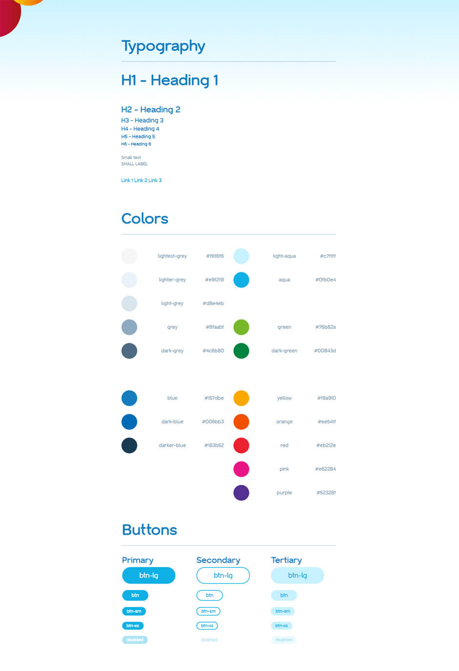
As the only front-end developer addressing styling, it was important to establish a set of standards that I could communicate with the rest of the team. By creating a style and code guide, not only could developers use examples from the repository, it also gave designers a chance to audit modules before being placed on live pages. It proved to be even more practical when the team tripled in size over the span of a few weeks. With the guides, new hires were able to ramp up quickly without compromising the quality of the build.
Bringing Keno to Life


During the entire time Keno was in development, this commercial was being broadcast all across Australia. And while the initial designer prototypes were more than acceptable, the animations didn't quite capture the metaphor of the ball, "mistaking animation for delight".
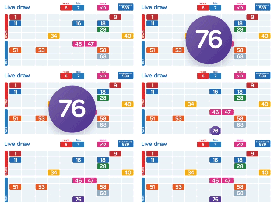
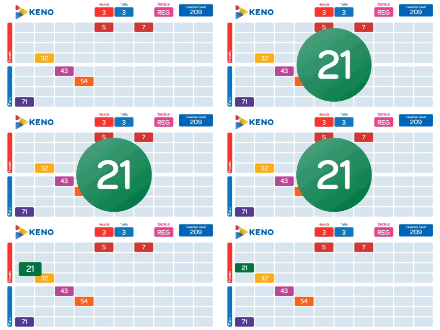
Advocating for more time to revisit this problem, I placed an emphasis on seamless transitions and timing. By using a combination of 3D CSS transforms, I was able to place the game ball on the board without resorting to fading in two separate elements. Furthermore, because each ball is drawn in succession and appears on the screen for only a limited amount of time, easing functions were used to maximize the duration that a ball is visible.
Lastly and possibly the most difficult aspect of the build, the entire web app is responsive, allowing players on mobile and tablet devices to enjoy Keno on the go.


